可折叠内容块 data-rolecollapsible其次,在容器中,添加任何头部区域的标题(h1-h6)或图例元素(egend ele
可折叠内容块 data-role="collapsible"
其次,在容器中,添加任何头部区域的标题(h1-h6)或图例元素(egend element)。JQuery Mobile框架将样式化头部,使其看起来像一个可点击的按钮,并添加一个“+”图标左边表示它的膨胀。
最后,在头部区域后,添加任何HTML标记作为被折叠的内容区域。JQuery Mobile框架将把这个标记为包裹起来。当点击头部标题的时候,内容将被折叠隐藏或者显示出来。
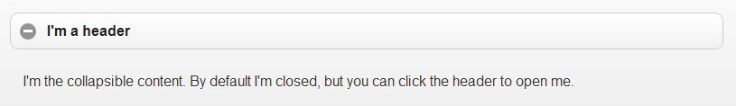
默认情况下,内容是被折叠起来的。
<div data-role="collapsible"> <h3>I'm a header</h3> <p>I'm the collapsible content. By default I'm closed, but you can click the header to open me.</p></div>

折叠起来的样式
点击被打开样式
??
展开折叠<div data-role="collapsible" data-collapsed="false" >
??
取消圆角?data-inset="false"
默认情况下折叠区域有插图的外观(两头有圆角等)。若要让他们全屏宽度无角造型,给容器添加 data-inset="false" 属性。
<div data-role="collapsible" data-inset="false" >

??
迷你型<div data-role="collapsible" data-mini="true" >

??
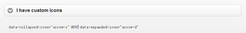
自定义图标
展开前的效果
展开后的效果
??
图标定位
??
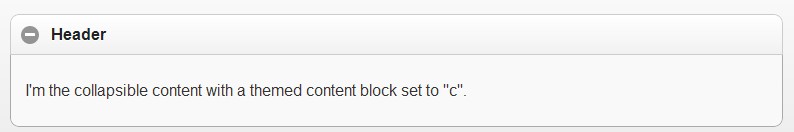
折叠内容区的主题样式
展开前的效果
展开后的效果
??
折叠标题区的主题样式
展开前的效果
展开后的效果
??
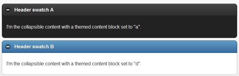
嵌套折叠区
根据需要折叠区可以彼此嵌套。在下面例子中,我们设置的内容主题提供清晰的视觉效果。
?
<div data-role="collapsible" data-collapsed="false" data-theme="e" data-content-theme="c"><h3>I'm a header</h3><p>I'm the collapsible content. By default I'm open and displayed on the page, but you can click the header to hide me.</p><div data-role="collapsible" data-theme="c" data-content-theme="c"><h3>I'm a nested collapsible with a child collapsible</h3><p>I'm a child collapsible.</p><div data-role="collapsible" data-theme="d" data-content-theme="d"><h3>Nested inside again.</h3><p>Three levels deep now.</p></div><!-- /section 1A --></div><!-- /section 1 --><div data-role="collapsible" data-content-theme="c"><h3>Section 3: Form elements</h3><form action="#" method="get"><div data-role="fieldcontain"><label for="textarea">Textarea:</label><textarea cols="40" rows="8" name="textarea" id="textarea"></textarea></div><div data-role="fieldcontain"><label for="slider">Input slider:</label> <input type="range" name="slider" id="slider" value="0" min="0" max="100" /></div><fieldset data-theme="c">Cancel</button></div><div data-theme="b">Submit</button></div> </fieldset></form></div><!-- /section 2 --><div data-role="collapsible" data-content-theme="c"><h3>Section 4: Collapsed list</h3><p>Here is an inset list:</p><ul data-role="listview" data-inset="true" data-theme="d"><li><a href="index.html">Acura</a></li><li><a href="index.html">Audi</a></li><li><a href="index.html">BMW</a></li><li><a href="index.html">Cadillac</a></li><li><a href="index.html">Chrysler</a></li><li><a href="index.html">Dodge</a></li><li><a href="index.html">Ferrari</a></li><li><a href="index.html">Ford</a></li></ul></div><!-- /section 3 --></div>
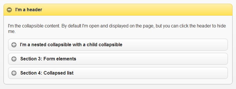
展开前的效果
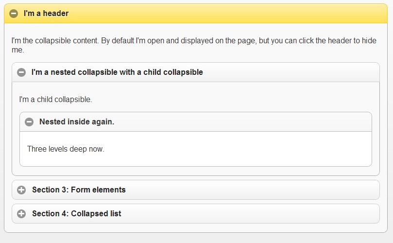
展开后的效果
转自:http://www.lampweb.org/jquerymobile/10/34.html