HTML5/CSS3翻转动画(一)翻转动画效果,就是将页面的元素(文字,图片)加入围绕坐标轴翻转的效果,在Webkit内核
HTML5/CSS3翻转动画(一)
翻转动画效果,就是将页面的元素(文字,图片)加入围绕坐标轴翻转的效果,在Webkit内核的浏览器中,很容易实现。而其它内核暂时支持不是很好。首先,我们创建页面:
<!DOCTYPE html><html><head><meta http-equiv="Content-Type" content="text/html; charset=UTF-8"><script type="text/javascript" src="js/jquery.js"></script><title>Flip Text</title></head><body><div id="cover"><div id="coverText"><div id="welcomeStr1">Welcome To HTML5!</div><div id="welcomeStr2">Hello World!</div></div></div></body>
代码很简单,其中仅包含两个文本信息用于测试。引入jQuery是为了后面的事件绑定,我们使用CSS3的动画支持来展示,那么下面来逐一看看CSS代码:
*{ margin:0px; padding:0px;}#cover{ position:absolute; width:100%; height:100%; min-width: 768px; overflow: hidden; background: -webkit-gradient(linear,left top, left bottom, color-stop(0, #00BDF2), color-stop(1, #003D7B)); background: -moz-linear-gradient(top,#00BDF2, #003D7B);}这段很简单,就是设置页面背景色的。这里可以在FF中看到效果。下面是对文本的CSS支持:
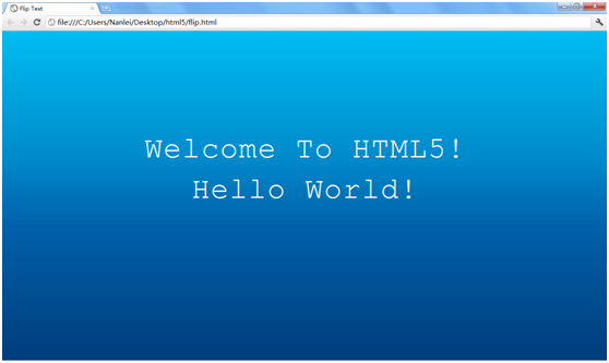
#coverText { position: absolute; left: 18%; top: 30%;width:64%;text-align:center;}#welcomeStr1,#welcomeStr2 {height: 86px;font-size: 64px;line-height: 86px;letter-spacing: 2px;color: white;font-family:"Courier New";-webkit-animation-time-function: linear;}目前我们得到如下效果:
下面设置让文字翻转的CSS3动画:
@-webkit-keyframes flip {0% {-webkit-transform: rotateY(0deg) scale(1,1);color: white;}70% {-webkit-transform: rotateY(0deg) scale(1,1);color: white;}100% {-webkit-transform: rotateY(90deg) scale(0.6,0.7);color: #3C4043;}}该段代码的含义是,围绕y轴翻转文字,并在最后文字大小发生变化,并变色。当然如果想沿着x轴旋转,那么使用rotateX就可以了,这很简单。现在在CSS中补加如下代码:
-webkit-animation: flip 5s infinite;-webkit-text-size-adjust: none;
我们可以看到的效果是文字围绕y轴主键变小,并变色,最终合并到y轴,但突然还原。这个效果是没错的,因为我们只有前半部分的动画效果,而后半部分翻转回来的没有设置,也就是我们看到的主键消失但突然出现的效果了。下面继续设置CSS动画,因为翻转过去了还得翻转回来吧:
@-webkit-keyframes unflip {0% {-webkit-transform: rotateY(90deg) scale(0.6,0.7);color: #3C4043;}100% {-webkit-transform: rotateY(0deg) scale(1,1);color: white;}}那么翻转回来我们定义名称为unfilp,此时不设置70%的停顿延时,直接翻转回来即可。我们看到,0%时是和上面flip中100%接上的,scale和color都是一致的。而100%是和flip中0%对应的,那么就可以达到还原的效果了。
此时可以修改-webkit-animation来测试这一步的效果。
好,现在问题来了,我们设置了两个CSS动画,那么怎么应用可以按顺序来执行呢,写到-webkit-animation中使用多个动画效果,好像不支持,或许是我写的不对。那么只好借助js来简单实现了。也就是事件绑定。Webkit中有个事件是webkitAnimationEnd,我们可以将两个动画绑定到这个事件上,就可以达到自动按顺序执行。我们编写一个js函数来达到这个效果:
flip = function(element, flipName, flipTime, unflipName, unflipTime) {if(!element){return;}element.style.webkitAnimation = "" + flipName + " " + flipTime;return $(element).bind('webkitAnimationEnd', function() {switch (element.style.webkitAnimationName) {case flipName:return element.style.webkitAnimation = "" + unflipName + " " + unflipTime;break;case unflipName:return element.style.webkitAnimation = "" + flipName + " " + flipTime;break;}});};flip函数定义功能如下:首先判断一下element,当然可以不做,只要在调用的时候保证即可。然后给webkitAnimation赋值,就是我们定义的CSS动画名称和执行的时间。下面就是核心功能所在了。巧妙使用事件绑定和switch的返回机制。将webkitAnimationEnd按照filp动画的名称进行绑定。这里格外注意,element.style.webkitAnimation = "" + flipName + " " + flipTime;一句绑定了正向翻转的CSS动画和时间,那么为了有反向的效果,下面的Switch段是相反的,也就是case filpName时进行unflip动画。
写好了js函数,那么我们来调用:
$(function() { flip($("#welcomeStr1")[0], 'flip', '1.5s', 'unflip', '0.7s'); flip($("#welcomeStr2")[0], 'flip', '1.5s', 'unflip', '0.7s');});我们把两个文本段绑定flip执行1.5秒,unflip执行0.7秒。最终我们就可以看到翻转的文字效果了:
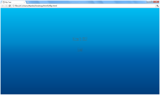
我们截取到一个翻转中的效果,大家可以使用webkit内核的浏览器来进行测试,就可以看到连续的翻转效果了。
此时两个文本段的动画效果是同步的,因为我们设置的时间都是一样的,如果想不同步,修改时间就可以了,这样就能根据自己的需求来确定了。
最后附上本文整体代码,jQuery的库那就自行去添加吧:
<!DOCTYPE html><html><head><meta http-equiv="Content-Type" content="text/html; charset=UTF-8"><script type="text/javascript" src="js/jquery.js"></script><title>Flip Text</title><style>*{ margin:0px; padding:0px;}#cover{ position:absolute; width:100%; height:100%; min-width: 768px; overflow: hidden; background: -webkit-gradient(linear,left top, left bottom, color-stop(0, #00BDF2),color-stop(1, #003D7B)); background: -moz-linear-gradient(top,#00BDF2, #003D7B);}#coverText { position: absolute; left: 18%; top: 30%;width:64%;text-align:center;}#welcomeStr1,#welcomeStr2 {height: 86px;font-size: 64px;line-height: 86px;letter-spacing: 2px;color: white;font-family:"Courier New";-webkit-animation-time-function: linear;}@-webkit-keyframes flip {0% {-webkit-transform: rotateY(0deg) scale(1,1);color: white;}70% {-webkit-transform: rotateY(0deg) scale(1,1);color: white;}100% {-webkit-transform: rotateY(90deg) scale(0.6,0.7);color: #3C4043;}}@-webkit-keyframes unflip {0% {-webkit-transform: rotateY(90deg) scale(0.6,0.7);color: #3C4043;}100% {-webkit-transform: rotateY(0deg) scale(1,1);color: white;}}</style><script type="text/javascript">flip = function(element, flipName, flipTime, unflipName, unflipTime) {if(!element){return;}element.style.webkitAnimation = "" + flipName + " " + flipTime;return $(element).bind('webkitAnimationEnd', function() {switch (element.style.webkitAnimationName) {case flipName:return element.style.webkitAnimation = "" + unflipName + " " + unflipTime;break;case unflipName:return element.style.webkitAnimation = "" + flipName + " " + flipTime;break;}});};$(function() { flip($("#welcomeStr1")[0], 'flip', '1.5s', 'unflip', '0.7s'); flip($("#welcomeStr2")[0], 'flip', '1.5s', 'unflip', '0.7s');});</script></head><body><div id="cover"><div id="coverText"><div id="welcomeStr1">Welcome To HTML5!</div><div id="welcomeStr2">Hello World!</div></div></div></body>本文谨抛砖引玉的介绍,欢迎交流,希望对使用者有用。
下一篇我们继续来深入探讨HTML5/CSS3的简单动画。